The Complete Guide to Fixing a Cheap-Looking Living Room
Small design choices make a bigger difference than you think. This guide shows you how to create a living room that feels elevated, cohesive, and far from cheap.
When Your Living Room Just Isn’t Giving
You can spend money on a living room and still end up with a space that feels flat, awkward, or strangely underwhelming.
That is the frustrating part.
Most people do not end up with a cheap-looking room because they have bad taste. They end up with one because nobody really explains what creates that feeling in the first place. So they buy more decor, add more cushions, hang random wall art, and hope the room starts to feel elevated. Usually, it just gets busier. A living room rarely looks cheap because of one terrible item. It usually happens because of a collection of small decisions that make the space feel disconnected, rushed, cluttered, or visually off balance. The good news is that the opposite is also true. A room can start looking far more polished, intentional, and expensive without a full makeover. Often, the instant fix is not buying more. It is changing what feels wrong, heavy, or chaotic. If your living room looks almost right but still feels off, these are the details that are probably dragging it down and exactly what to do instead.
The real reason some living rooms look cheap
A living room looks expensive when it feels intentional. That does not mean formal. It does not mean sterile. It does not mean filled with designer furniture. It means the room feels considered.
The furniture makes sense for the size of the room. The lighting feels warm instead of harsh. The rug grounds the seating area. The styling has breathing room. Nothing looks like it was thrown in at the last minute just to fill space. Cheap-looking rooms often feel like nobody paused to ask one important question.
Does this room feel calm, balanced, and finished?
When the answer is no, the room usually shows a few of the signs below.
IN THIS GUIDE
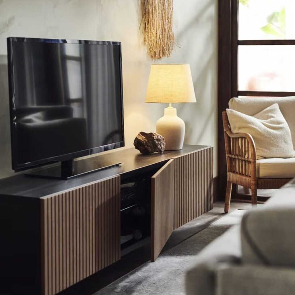
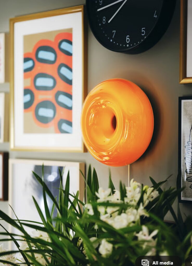
Bad lighting makes everything look worse
Lighting is one of the fastest ways to make a living room look flat, cold, and far less elevated than it could be.
A single harsh ceiling light can make beautiful furniture look tired. It can make shadows feel sharp, colours look dull, and the whole room feel more like a waiting area than a home.
This is one of the biggest reasons a room looks cheap even when the furniture itself is not bad.
What to do instead
Use layered lighting so the room feels softer and more dimensional.
A good living room usually has a mix of the following:
- one overall light source
- one floor lamp
- one table lamp
- one smaller mood light or accent light
This instantly makes the room feel warmer, more lived in, and far more intentional.
Quick designer shift
If your living room only has the big light, start with one tall floor lamp in a dark corner and one table lamp on a side table or console. That single change can completely change how the room feels at night.
Good lighting is the quickest way to make your living room feel warm, elevated, and intentional. A mix of light sources adds depth, softness, and that cozy “finished” feeling every space needs.
Lighting That Changes Everything
Layered lighting makes a living room feel warmer, softer, and far more pulled together. Instead of pushing products into your face, this kind of recommendation helps readers understand what actually improves the room.
My personal favourite pieces for this look
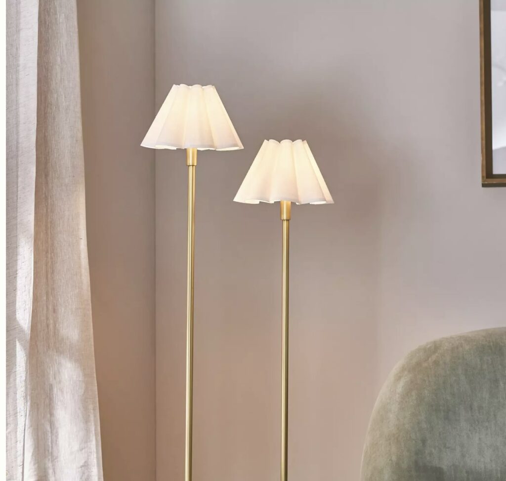
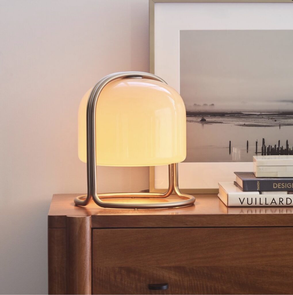
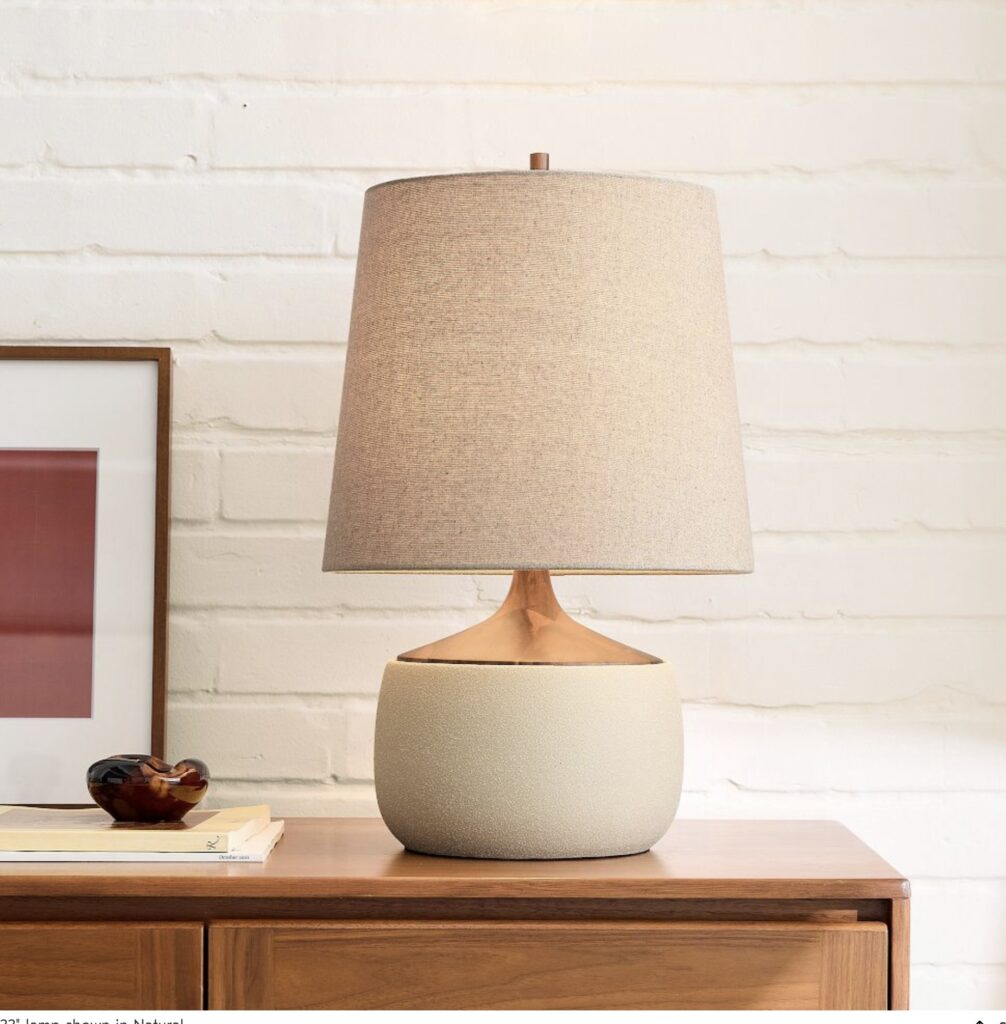
These are the exact lighting pieces I would recommend for creating a warmer, more layered living room without making the space feel overdone. You do not need every piece. Even one or two can make a huge difference.
A rug that is too small makes the room feel disconnected
This is one of the most common reasons a living room looks cheap, and once you notice it, you cannot unsee it.
A tiny rug floating in the middle of the room makes all the furniture feel separate. It creates that awkward showroom mistake where nothing feels anchored.
Even a beautiful sofa can look less expensive when it is sitting around a rug that is clearly the wrong size.
What to do instead
Use a rug large enough to connect the seating area.
In most living rooms, at least the front legs of the sofa and chairs should sit on the rug. That simple shift makes the space feel grounded and properly designed.
Rug sizing rule to remember
| Room situation | Better rug approach |
|---|---|
| Small living room | Let the front legs of key furniture sit on the rug |
| Medium living room | Use a rug that connects the full seating zone |
| Tight budget | Buy fewer decor items and put the money toward a better rug size |
A well-sized rug does more for the room than extra candles, vases, or random styling objects ever will.
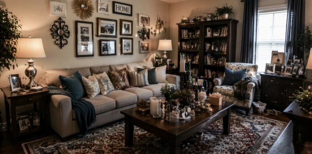
Too much little decor makes the room feel messy, not styled
This is a big one.
People often think an expensive room has lots of decor. In reality, expensive-looking rooms are usually edited better.
A coffee table with seven tiny objects on it does not feel styled. It feels nervous.
A shelf packed edge to edge does not feel collected. It feels crowded.
When every surface is full, the eye has nowhere to rest. The room starts feeling cheaper because it feels visually noisy
BEFORE
Cluttered & Chaotic
Too many small decor items, busy patterns, cluttered surfaces, and no breathing
room for the eye.
It feels noisy and
visually overwhelming.
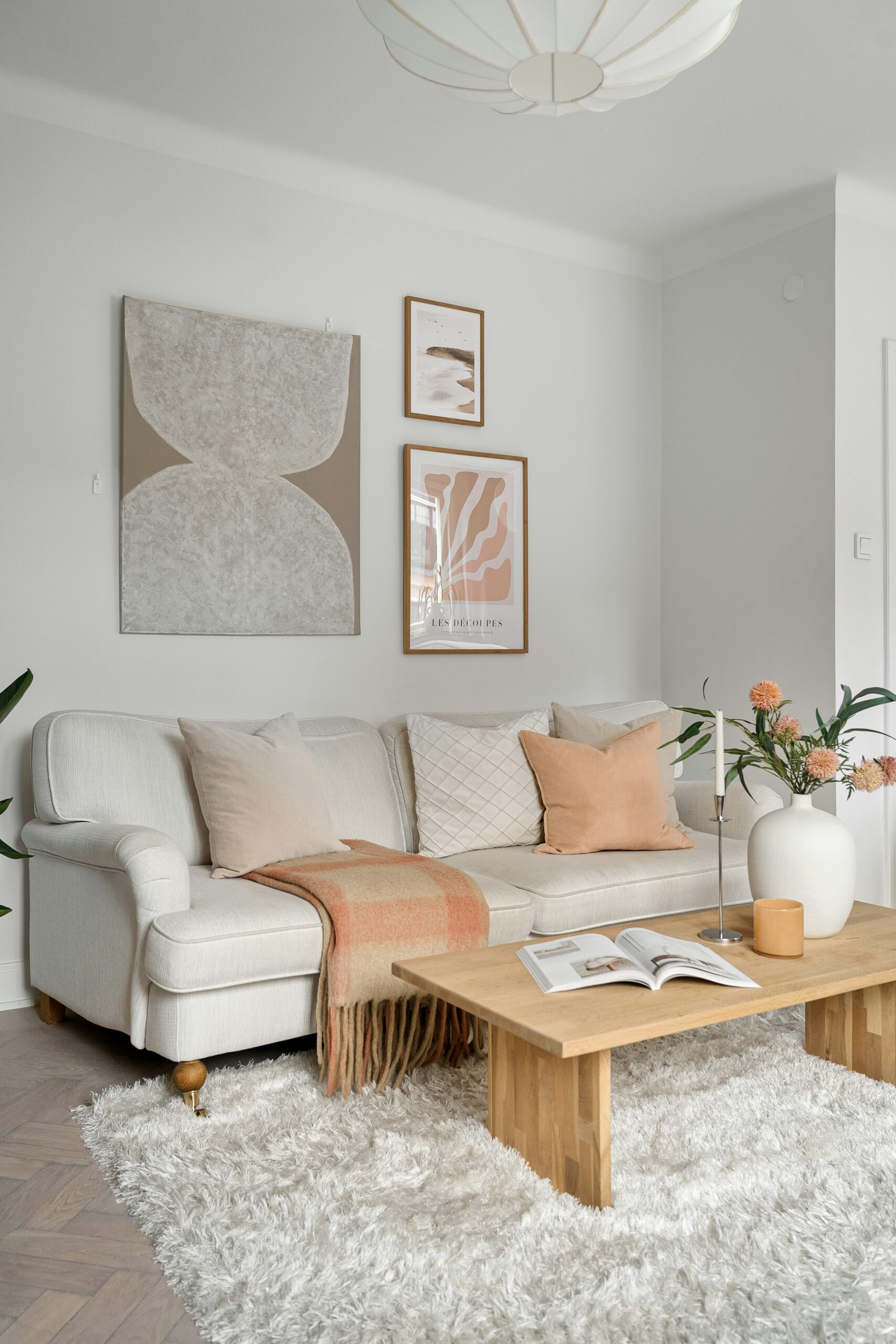
AFTER
Simple &
Sophisticated
Edited decor, clean surfaces, cohesive colors, and layers of
texture.
The room feels calm, intentional, and
expensive.
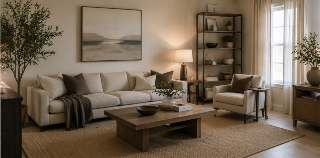
What to do instead
Style in groups. Leave breathing room. Let a few pieces matter.
A tray on a coffee table with a candle, one small object, and one book can look far more elevated than a table covered in unrelated bits and pieces.
Try using this simple styling formula:
Easy styling formula for a more expensive look
One practical piece
A tray, bowl, or basket
One object with height
A candle, vase, or sculptural item
One softer element
A small stack of books, beads, or natural texture
That is often enough.
A good question to ask yourself
Does this look styled, or does it look like I was scared to leave empty space?
That question alone can save a room.
Everything matching too perfectly can make the room feel generic
This surprises people, because matching seems like the safe way to make a room look put together.
But when every piece feels too coordinated, the room can start to look like it was bought all at once from one page of a catalogue. That often reads less designer and more basic.
Matching side tables, matching cushions, matching decor, matching frames, matching everything can flatten the room.
What to do instead
Aim for cohesion, not sameness.
A room feels richer when there is some contrast in material, shape, and texture. Think linen with wood. Wood with metal. Soft upholstery with a slightly rough woven rug. Rounded objects with straighter furniture lines.
That mix adds depth, and depth makes a room feel more expensive.
Cheap-looking curtains can ruin the whole room
Curtains are one of those details people do not think about much until they are up and something just feels… off.
The room suddenly feels shorter. The window looks smaller. The whole space loses that soft, elevated feeling you were going for.
And the frustrating part is that even a beautiful sofa, rug, and decor will not fix it. Bad curtains quietly drag everything down.
Most of the time, it comes down to three things: height, width, and fabric.
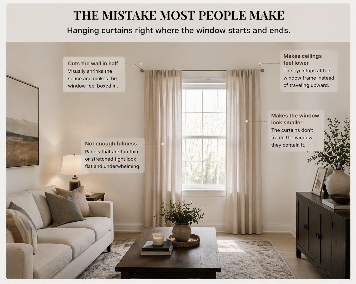
The mistake most people make
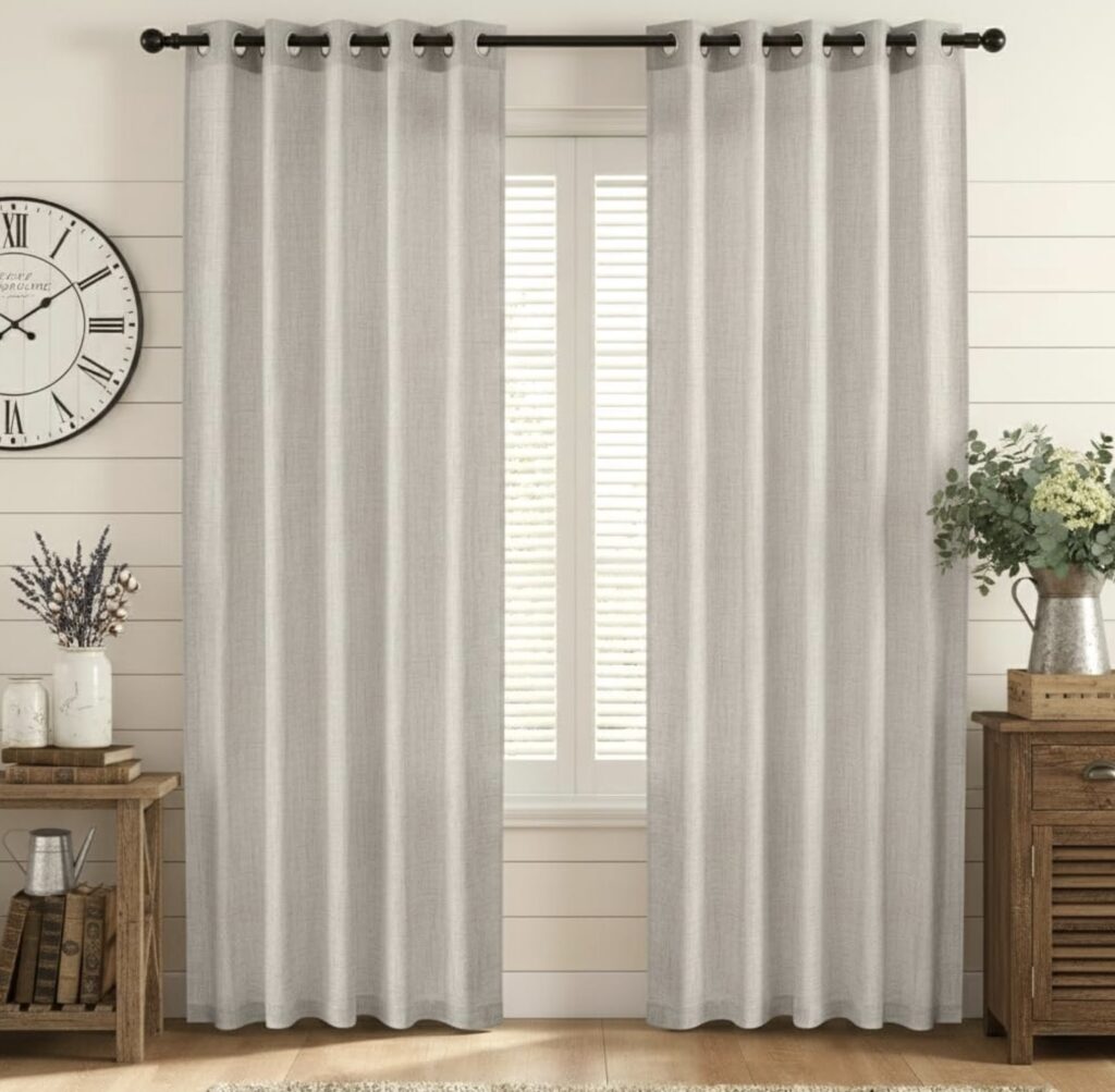
People tend to hang curtains exactly where the window starts and ends.
It feels logical, but visually it does the opposite of what you want.
It cuts the wall in half, makes ceilings feel lower, and makes the window look smaller than it actually is.
Then there is the fullness issue.
Panels that are too thin or stretched tight across the rod can make the whole setup feel a bit flat and underdone, almost like it was an afterthought instead of part of the design.
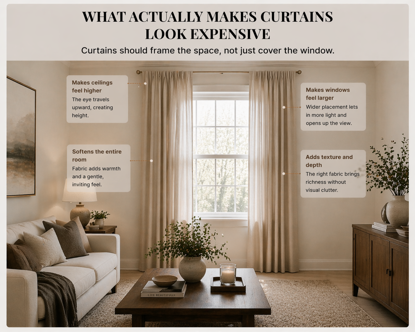
What actually makes curtains look expensive
Curtains should not just cover a window. They should frame the space.
That shift in thinking changes everything.
When done properly, curtains can:
- make ceilings feel higher
- make windows feel larger
- soften the entire room
- add texture and depth without clutter
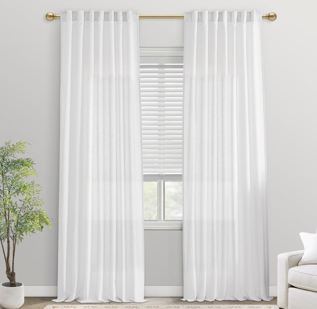
The simple placement upgrade that changes everything
Instead of following the window, follow the wall.
- Hang the curtain rod higher than the window frame
Ideally closer to the ceiling than the top of the window - Extend the rod wider than the window
This allows the curtains to sit to the sides instead of blocking light
This creates the illusion that the window is bigger and the room is taller, even though nothing structural has changed.
Fullness matters more than people think
This is where many rooms start to look a bit cheap without it being obvious why.
Curtains should not look stretched across the rod.
They should feel soft and slightly gathered, even when open.
A good rule is that your curtain width should be about 1.5 to 2 times the width of your window.
That extra fabric is what creates that relaxed, effortless look instead of something stiff and flat.
Fabric is where the “cheap vs expensive” feeling really shows
This is the part people underestimate the most.
Certain fabrics immediately read as lower quality, even if you cannot explain why.
Try to avoid:
- overly shiny materials
- very thin, see-through fabrics that look flimsy
- stiff curtains that do not drape naturally
Instead, look for:
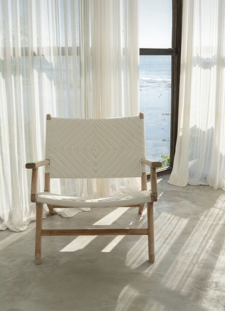
- linen or linen-look fabrics
- soft cotton blends
- slightly textured materials
These catch light in a softer way and instantly make the room feel calmer and more refined.
If you only change one thing
Raise your curtain rod higher and extend it wider.
That one adjustment alone can make your entire living room feel more elevated without buying anything new.
Where Good Curtains Make All the Difference
Curtains are one of those things people don’t always think about until they’re up and suddenly making the room feel smaller, shorter, and less polished.
Hang your curtain rod higher and wider than the window frame, and choose panels with enough
fullness to create soft, natural folds.
The right fabric, like linen or a linen blend, makes all the difference. It adds texture, softens the light, and
instantly makes the space feel more elevated.
THE SIMPLE FORMULA
Hang the rod high (closer to the ceiling)
Extend it wide (past the window frame)
Use full panels (1.5-2x the window width)
MY PERSONAL FAVOURITE AMAZON FINDS
Beautiful, timeless options that instantly elevate your living room.
LINEN CURTAIN PANELS
Light-filtering and effortlessly elegant.
The perfect everyday curtain.
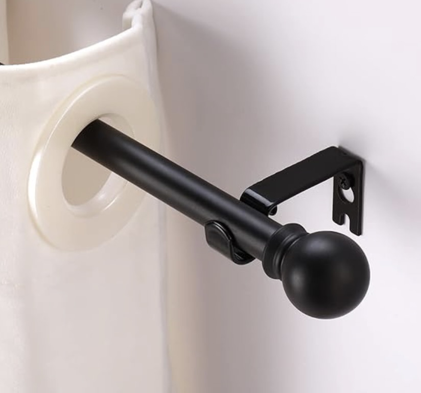
HIGH QUALITY CURTAIN ROD
A small detail that makes a big
difference in the overall look.
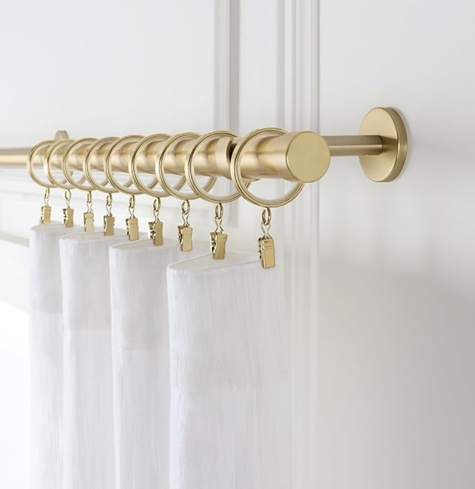
The right curtains can completely change how a room feels. Even this small update can make your
living room look taller, softer, and far more expensive.
Furniture that is the wrong scale throws the whole room off
A room can look cheap when the furniture feels too bulky, too tiny, or badly spaced for the room it is in.
This is not always about the furniture itself being bad. Sometimes it is simply the wrong size for the space.
An oversized sofa in a small room can make everything feel squeezed. Tiny scattered furniture in a larger room can make the space feel temporary and unsure of itself.
What to do instead
Pay attention to visual weight, not just measurements.
Furniture with visible legs often feels lighter. Pieces with cleaner lines can help a small living room feel more open. A coffee table that is too small can look disconnected, while one that fits the seating zone feels intentional.
Quick room check
Ask yourself:
- does the sofa dominate the room
- do the tables feel too tiny beside it
- is there enough breathing space around the furniture
- does the layout feel settled or random
If the scale feels off, the room will rarely feel expensive.
| Element | Ideal proportion |
|---|---|
| Coffee table | About 2/3 the width of your sofa |
| Space around furniture | At least 60–90 cm walking space |
| Side tables | Roughly the same height as sofa arms |
| Rug | Large enough to anchor front legs of furniture |
Designer insight:
Rooms rarely feel expensive because of the furniture itself. They feel expensive when the proportions feel calm and balanced. Even simple furniture can look elevated when the scale is right.
Blank walls or random wall art both hurt the room
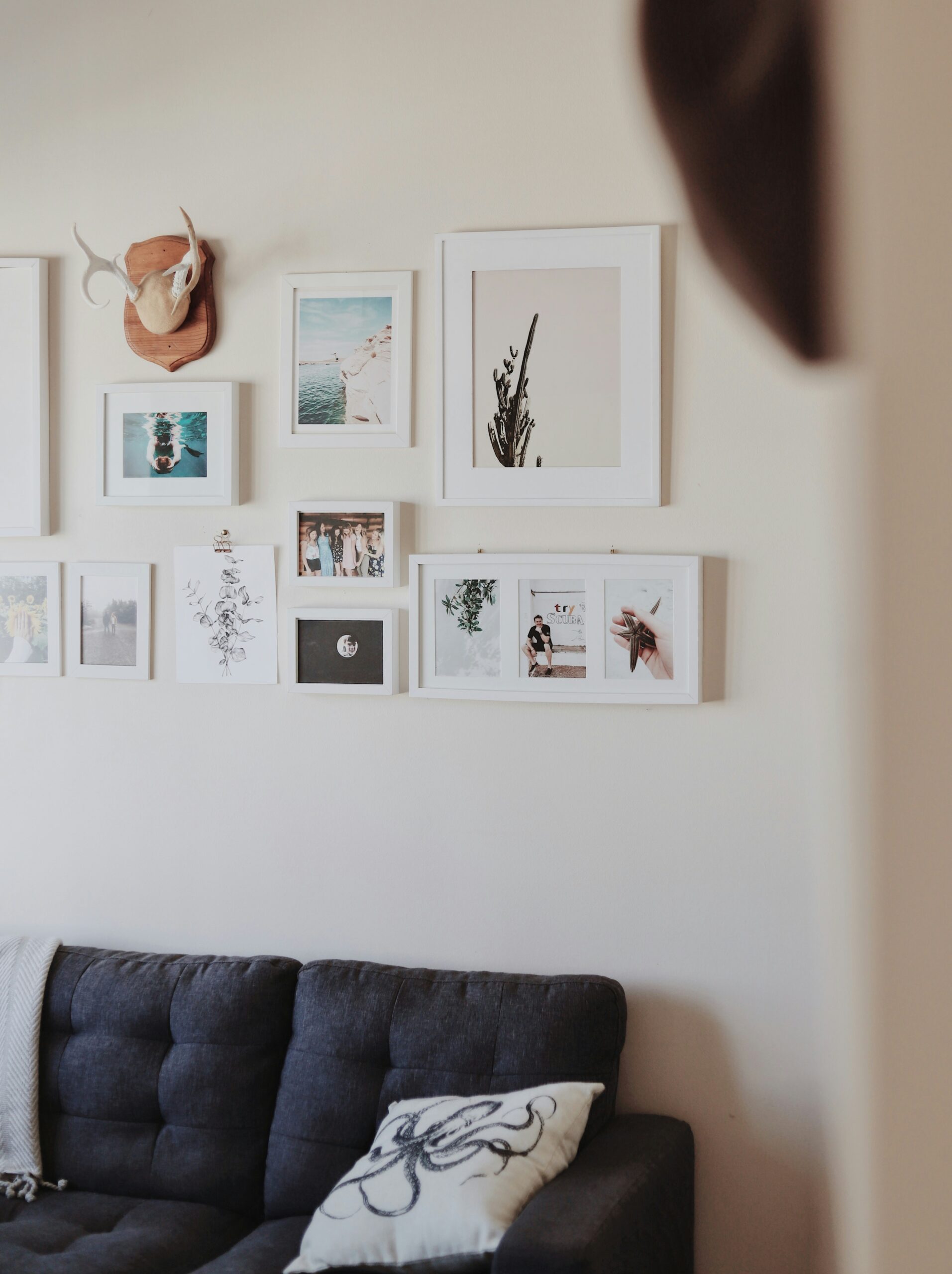
A totally bare wall can make a living room feel unfinished. But random small pieces hung without intention can be just as damaging.
This is where rooms often start to feel cheap in a very subtle way. The wall art is too small, placed too high, or does not relate to the furniture below it. The result is a room that feels disconnected instead of complete.
Make wall decor feel anchored to the furniture.
Above a sofa, art should usually feel proportionate to the width of the sofa. It should not look like a lonely afterthought floating in space.
Large scale art often feels more elevated than lots of tiny pieces. If you prefer a gallery wall, keep it intentional with spacing, colour connection, and a clear overall shape
Well-scaled artwork anchored above the sofa creates a calm, balanced focal point.
A thoughtfully arranged gallery wall adds personality without making the space feel cluttered.
The mistake most people make
People tend to treat wall art as something separate from the rest of the room.
They hang pieces wherever there is empty space, without thinking about how it connects to the furniture below.
That is when you get:
- artwork that is too small for the wall
- pieces hung too high
- frames that feel disconnected from the sofa or console
- gallery walls that look random instead of curated
The result is a room that feels slightly awkward, even if you cannot immediately explain why.
What actually makes wall decor feel expensive
Wall decor should not feel like decoration added at the end.
It should feel like part of the structure of the room.
That shift in thinking changes everything.
When wall art is done well, it:
- anchors the furniture
- creates a clear focal point
- balances the proportions of the room
- helps the space feel complete
The “anchoring” rule that changes everything
Instead of decorating the wall on its own, connect it to what is below it.
Above a sofa, artwork should feel visually tied to the sofa, not floating somewhere above it.
A good guideline is:
- the artwork or arrangement should be around two-thirds the width of the sofa
- it should sit closer to the sofa than to the ceiling
- it should feel centred and balanced with the furniture
If the art feels like it is drifting upward or looks too small, the whole room loses that grounded feeling.
A quick check you can do in your own space
Stand back and look at your wall.
Ask yourself:
- does this feel connected to the furniture below
- does it look balanced or slightly awkward
- is there a clear focal point
- does my eye know where to rest
If the answer feels uncertain, the wall likely needs adjusting, not more decor.
How to make a gallery wall actually work
A gallery wall can look beautiful, but only when it feels intentional.
The difference between a curated gallery wall and a messy one is subtle but very noticeable.
To make it work:
- keep a consistent colour palette
- use frames that relate to each other
- plan the layout before hanging
- maintain even spacing between pieces
- create a clear overall shape instead of scattering randomly
Think of it as one composition, not separate items.
If you only change one thing
Lower your artwork slightly and make sure it relates to the width of your sofa.
That one adjustment alone can make your living room feel far more polished.
Visible cords and everyday mess quietly cheapen the room
Even a beautiful room can lose its impact when cords are dangling, chargers are visible, remotes are scattered around, and practical clutter has no home.
This is one of those things that people feel before they consciously notice it.
The room does not feel calm. It does not feel finished. It feels temporary.
What to do instead
Give the unattractive basics a place to disappear into.
Use baskets, boxes, concealed storage, and cable management so the room can breathe.
You do not need perfection. You just need less visual interruption.
Simple living room reset that works immediately
If your room feels cheap and you do not know where to start, do these five things before buying anything new:
| Quick reset step | Why it helps |
|---|---|
| Remove half the small decor | The room instantly feels calmer |
| Turn off harsh overhead lighting | Softer light makes everything look better |
| Pull the furniture into a more connected layout | The room feels intentional |
| Clear visible cords and random clutter | Less visual mess equals more polish |
| Restyle one main surface properly | One good focal point lifts the whole room |
This is often enough to reveal what the room actually needs and what it never needed in the first place.
Loose cords and scattered items break the flow and make the space feel less calm.
When everything has a place, the room finally feels calm, balanced, and complete.
Too many trendy pieces can make the room feel dated fast
Trends are not the problem.
The problem is when a room relies on them too heavily.
It is very easy to fall into the trap of recreating a look you saw online. A curved mirror, boucle chair, ribbed lamp, arched shelf, checkerboard rug, all in one space. Each piece looks good on its own, but together the room starts to feel like a trend checklist instead of a home.
That is when a space begins to feel forced.
And strangely, that is also when it starts to feel less expensive.
Because truly elevated rooms rarely try that hard.
The mistake most people make
People often think that adding more “on-trend” pieces will make their space look more current.
In reality, it usually does the opposite.
When everything is trendy:
- nothing stands out
- the room feels busy
- the style becomes predictable
- and it dates very quickly
Instead of feeling curated, the space starts to feel like it was copied from one moment in time.
The “foundation vs accent” approach
This is one of the simplest ways to avoid a trendy-looking room.
Keep these pieces more timeless:
- sofa shape
- rug
- main lighting
- coffee table
- larger storage pieces
These should feel:
- simple
- neutral or adaptable
- not tied to one trend
Let these carry personality and trend:
- cushions
- throws
- vases
- smaller decor
- artwork
- side tables
These are easier to change over time, which means your space can evolve without needing a full reset.
A quick way to check your space
Look around your living room and ask:
- would this still look good in a few years
- is everything trying to be the statement
- does the room feel calm or overstimulating
- do I have a clear focal point
If everything feels equally loud, that is usually the issue.

The room may not be cheap-looking at all. It may just be unfinished
This is important, because sometimes the problem is not that the room looks bad. It is that it stops halfway.
There is a sofa, maybe a rug, maybe a coffee table, but the room has not been taken to the point where it feels layered and complete.
An unfinished room can feel cheap simply because it lacks warmth, texture, contrast, and intention.
Signs your room feels unfinished
- there is no secondary lighting
- the walls feel forgotten
- there is very little texture
- the styling feels accidental
- the furniture placement does not fully make sense
- nothing leads the eye
What to do instead
Think in layers.
A polished living room usually includes:
- a strong anchor rug
- varied lighting
- one or two natural textures
- a focal point
- styling with space around it
- something soft
- something structured
- something with height
That is when a room starts to feel complete rather than simply filled.
The biggest mistake people make when trying to fix a cheap-looking living room
They buy more before editing what is already there.
That usually leads to a room with more clutter, more visual confusion, and more money spent on the wrong things.
The smartest fix is almost always this:
edit first, then upgrade what truly matters
Usually, the biggest impact comes from improving a few core elements:
- lighting
- rug size
- curtains
- furniture layout
- styling restraint
That is where a room changes.
Not with ten extra decorative objects. Not with panic buying. Not with one trendy piece that was supposed to magically save everything.
A designer-style checklist to use before you buy anything
Use this when your living room feels off and you want to figure out why.
Ask yourself these questions
Lighting
Does the room rely too heavily on one harsh source of light
Layout
Does the furniture actually connect, or is everything floating awkwardly
Rug
Is the rug big enough to ground the room
Styling
Are surfaces curated, or just filled
Scale
Do the furniture pieces feel right for the room
Texture
Does the room have warmth and depth, or does it feel flat
Curtains
Are the curtains helping the room feel taller and softer
Clutter
Are cords, remotes, and daily mess interrupting the look
If you answer no to several of those, that is likely why the room is not giving you that elevated feeling yet.
If your living room looks cheap, it is probably not because you failed. It is probably because the room is asking for better decisions, not more decisions.
That is actually encouraging.
Because once you understand what is making the space feel off, you stop guessing. You stop buying random decor. You start seeing the room the way a designer would see it.
You notice the harsh lighting. The too-small rug. The cluttered surfaces. The awkward scale. The curtains that are cutting the room short. The pieces that are technically fine but not helping the space feel calm or complete.
And when you fix those things, the room changes fast.
Not because it suddenly became fancy.
Because it finally started to feel intentional.
Articles you’d also love
Cozy Renter-Friendly Apartment Upgrades That Completely Transform Your Space
Loom Light Living RENTAL DECOR GUIDE Cozy Renter-Friendly Apartment Upgrades That Completely Transform Your Space…
The Ultimate Apartment Lighting Guide: Designer-Approved Finds for a Beautiful Home
THE ULTIMATE GUIDE Designer-Approved Lighting Finds for a Beautiful Home LOOM LIGHT LIVING Good lighting…
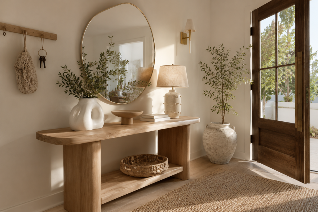
How To Make Your Entryway Feel Warm, Calm And Expensive
Loom Light Living warm living. slow beauty, soft luxury. How To Make Your Entryway Feel…
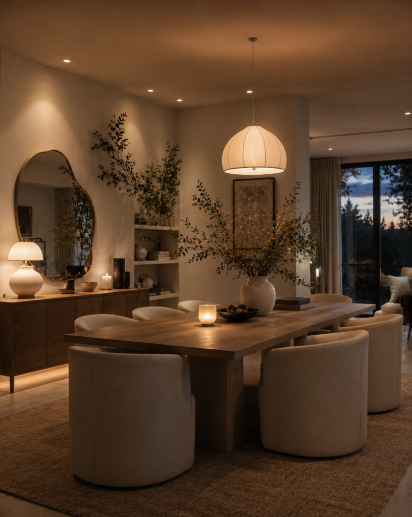
Why Modern Dining Rooms Feel Cold (And How To Make Them Feel Warm Again)
Loom Light Living warm living. slow beauty, soft luxury. Why Modern Dining Rooms Feel Cold…
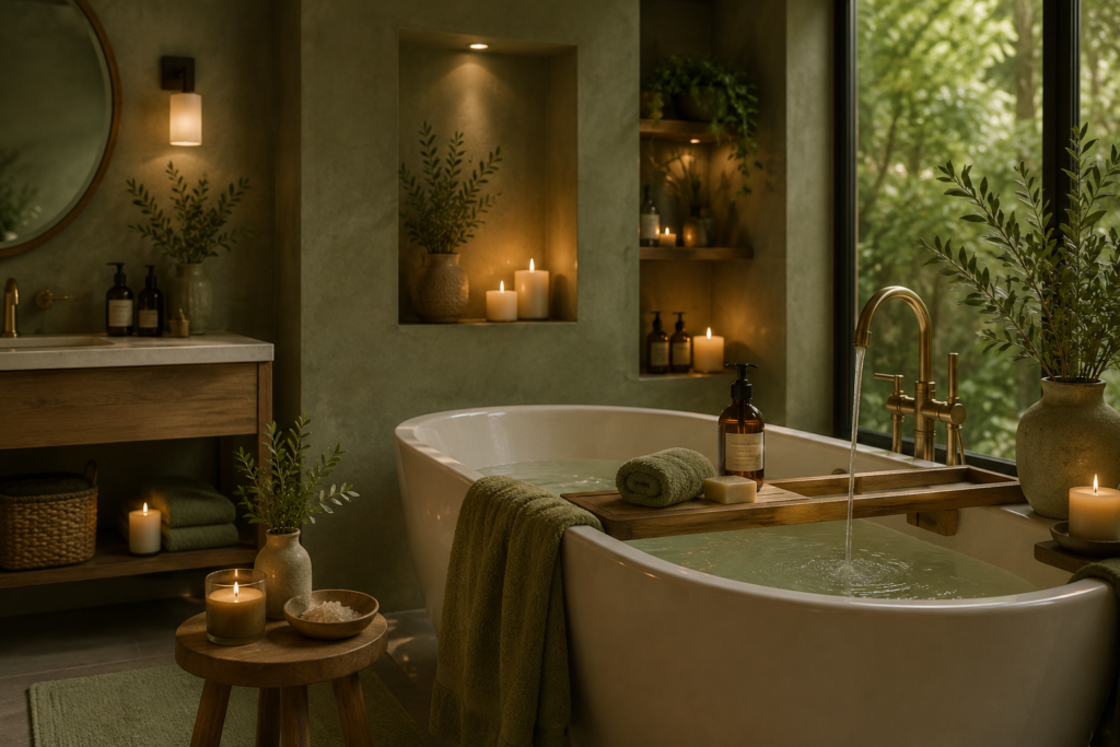
The Earthy Spa Bathroom Trend Everyone Is Obsessed With
⟡ ⟡ ⟡ The Earthy Spa Bathroom Trend Everyone Is Obsessed With WARM. CALM. NATURAL….
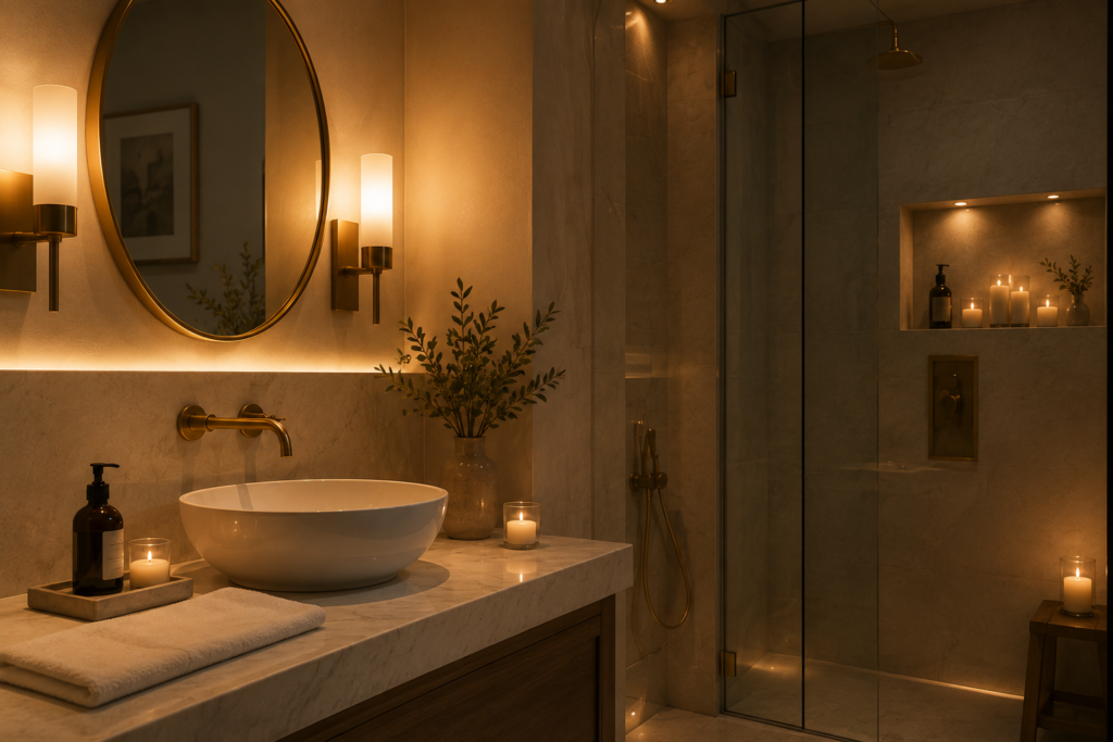
The Tiny Details That Make Hotel Bathrooms Feel Expensive
⟡ ⟡ ⟡ The Tiny Details That Make Hotel Bathrooms Feel Expensive Simple touches that…