10 Small Space Living Ideas That Actually Make Your Home Feel Bigger (2026 Guide)
Smart, design-led ways to open up your space, improve flow, and create a home that feels calm, airy, and effortlessly put together no matter the size.
Small Space, Big Personality
Living in a small space isn’t about limitation it’s about intention
Small spaces get a bad reputation for feeling cramped, cluttered, and impossible to style. But the truth is, it’s rarely about the size it’s about how the space is used.
With the right layout choices, furniture proportions, and a few smart design decisions, even the smallest room can feel open, calm, and intentionally designed. In fact, smaller spaces often have the advantage of feeling more curated, more thoughtful, and easier to maintain when done right.
This guide isn’t about unrealistic Pinterest perfection or expensive renovations. It’s about simple, practical ideas that actually make a difference the kind that instantly improve how your space looks and how it feels to live in.
Quick Wins That Make a Small Space Feel Bigger
If you don’t want to completely redesign your space, start here.
These small changes create an immediate difference.
✓ Choose furniture with visible legs
creates more open floor space.
✓ Keep your colour palette light and consistent
reduces visual clutter.
✓ Use mirrors strategically—not randomly
reflect light and add depth.
✓ Avoid oversized furniture
it overwhelms the room.
✓ Leave some space empty
not every corner needs to be filled.
✓ Use vertical space
makes ceilings feel higher.
These are the small shifts that change how a space feels instantly.
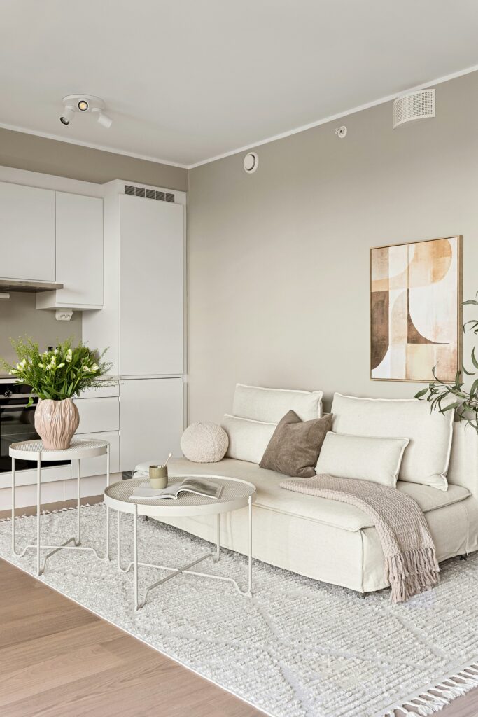
1. Why Light, Cohesive Colours Make a Space Feel Bigger
Why light colours expand space
Light colours reflect more natural and artificial light, which instantly makes a room feel more open and airy. Instead of absorbing light like darker shades do, soft tones such as warm whites, beiges, and light greys bounce light around the room, reducing harsh shadows and visual heaviness.
This creates a subtle illusion where walls feel further apart and ceilings appear higher. The result isn’t just a brighter space, it’s a space that feels less confined and more breathable.
designer insight
It’s not just about choosing “light colours”, but choosing tones that feel soft and slightly warm. Stark whites can sometimes feel flat, while warmer neutrals create depth without closing in the space.
Best Light Colours for Small Spaces
Colour Type
Why It Works
Best Use Case
Warm White
Reflects light without feeling harsh
Ceilings and Wall
Soft Beige
Adds warmth without heaviness
Living rooms, bedrooms
Light Grey
Neutral and modern
Contemporary spaces
“Greige” (grey + beige)
Balanced and versatile
Whole-home colour flow
Pale Taupe
Slight depth without closing space
Feature walls (subtle)
Why contrast can make a space feel smaller
While contrast can add visual interest, too much of it in a small space can actually work against you.
Strong contrasts like dark furniture against bright white walls, or multiple bold colours competing in one room visually “break up” the space. This creates clear stopping points for the eye, making the room feel more segmented and confined.
In smaller spaces, you want the eye to move smoothly without interruption. High contrast does the opposite, it creates visual boundaries that shrink the perception of space.
Think of it this way: The more your eye has to “stop and process,” the smaller the room will feel.
High Contrast vs Low Contrast (What Works Better)
High Contrast
– breaks visual flow and makes a space feel smaller
– creates strong visual stopping points for the eye
– best used in larger spaces that can handle more drama
Low Contrast
– creates a seamless visual flow that makes a space feel bigger
– allows the eye to move freely without interruption
– ideal for small spaces (your best choice)
Soft Contrast
– adds subtle interest without overwhelming the space
– keeps the room feeling calm and cohesive
– the perfect balance for most interiors
Why consistency matters more than just “white walls”
A common mistake is thinking that simply painting everything white will automatically make a space feel bigger. In reality, consistency is far more important than the specific colour you choose.
When colours, tones, and finishes flow seamlessly from one area to another, the eye moves effortlessly through the space. This creates a sense of continuity, which makes the room feel larger and more cohesive.
On the other hand, switching between too many colours, materials, or finishes, even if they’re all light — can make a space feel fragmented and visually cluttered.
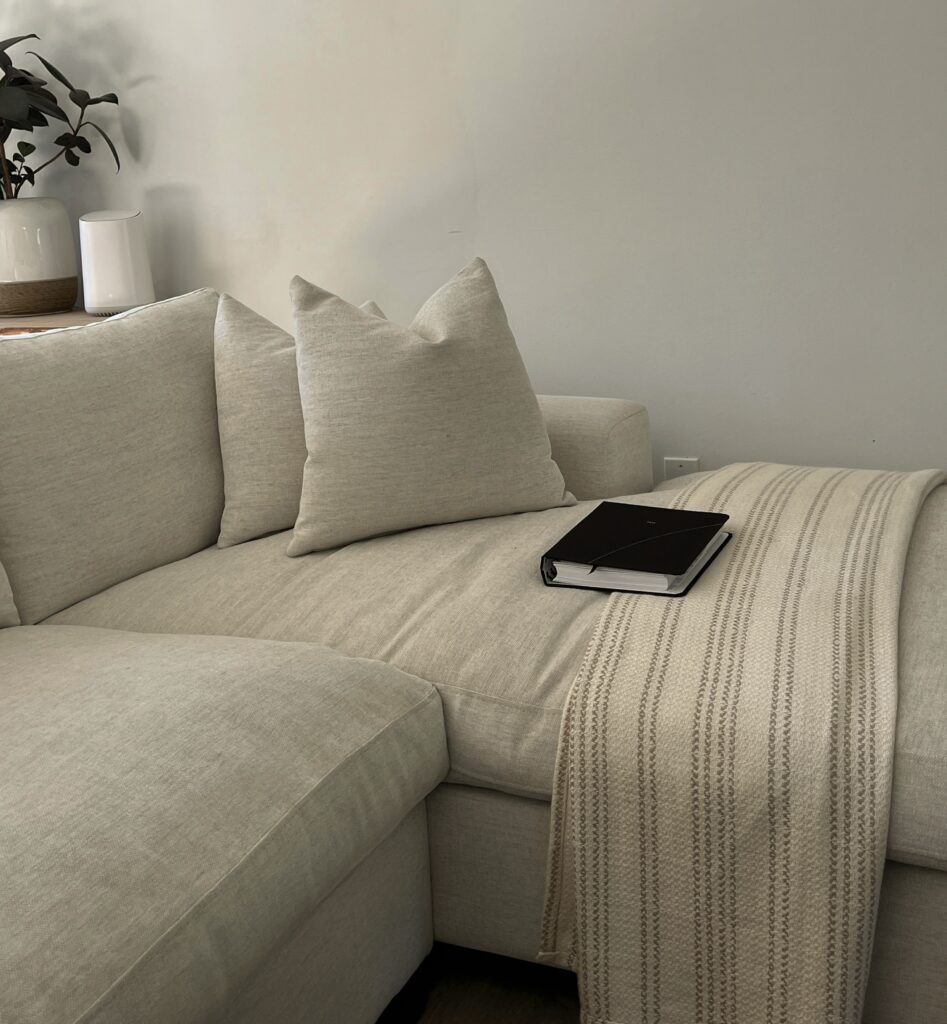
Designer tip: Choose a base palette of 2–3 tones and repeat them throughout your space for a calm, expansive feel.
2. Why furniture scale matters more than room size
When a space feels cramped, it’s often not because the room is small — it’s because the furniture is out of proportion to the space.
Scale refers to how large or small a piece of furniture feels in relation to the room and other objects around it. Even one oversized item can visually dominate a space, making everything feel tighter and more restricted.
In small spaces, the goal isn’t to fit as much as possible — it’s to create a sense of balance and openness.
The biggest mistake people make
Most people think:
“If my space is small, I need small furniture.”
But that’s not entirely true.
Using only tiny pieces can actually make a room feel:
- scattered
- underwhelming
- cluttered (because you add more items to compensate)
The real goal is:
Fewer, well-proportioned pieces — not just smaller ones
Common Furniture Mistakes (and What to Do Instead)
The wrong furniture can make even a decent-sized room feel cramped. These swaps instantly create more breathing space and a lighter overall feel.
MISTAKE 01
Bulky, Overstuffed Sofa
Instead of this:
A bulky, overstuffed sofa that visually weighs down the room.
Try this:
→ A slim-profile sofa with clean lines and raised legs.
Why it works: Creates more visible space underneath and keeps the room feeling lighter and less crowded.
MISTAKE 02
Heavy Wooden Coffee Table
Instead of this:
A dense, heavy coffee table that blocks visual flow.
Try this:
→ A light wood, glass, or open-frame table.
Why it works: Lighter materials keep the centre of the room feeling open and allow the space to breathe.
MISTAKE 03
Too Many Small Decor Pieces
Instead of this:
Lots of small decorative items scattered around the room.
Try this:
→ A few larger, more intentional statement pieces.
Why it works: This reduces visual clutter and makes the room feel more curated, not chaotic.
MISTAKE 04
Low, Wide Furniture
Instead of this:
Furniture that sits low and spreads heavily across the room.
Try this:
→ Raised furniture with visible legs.
Why it works: More visible floor area helps the room feel taller, lighter, and less compressed.
MISTAKE 05
Matching Bulky Furniture Sets
Instead of this:
Heavy matching sets that overwhelm the room.
Try this:
→ A mix of lighter, more minimal pieces.
Why it works: Mixing shapes and visual weight creates balance and stops the room from feeling overly dense.
The Key Idea
Instead of asking:
“Is this furniture small enough?”
Ask:
“Does this feel balanced in the space?”
A few well-placed, visually light pieces will always look better than many small, cluttered ones.
Quick Rule
If your furniture blocks the eye, the space will feel smaller.
If your furniture allows the eye to move, the space will feel bigger.
The Importance of Negative Space
Negative space simply means the empty space around and between furniture.
And in small spaces, it’s one of the most powerful design tools you have.
Why it matters
When every corner is filled, the room feels:
- crowded
- overwhelming
- harder to move through
But when you leave small gaps between furniture:
- the eye can move freely
- the space feels calmer
- everything looks more intentional
| Layout Style | How It Feels |
| Furniture packed tightly | Cramped and cluttered |
| Small gaps between pieces | Open and breathable |
| Empty corners allowed | Calm and balanced |
How to use negative space properly
- Leave space between furniture (don’t push everything together)
- Avoid filling every wall
- Group decor instead of spreading it out
- Let some areas stay intentionally empty
3. Think Vertical, Not Just Horizontal
Why it works
In small spaces, everything tends to sit at floor level — which makes the room feel crowded and heavy.
Using your walls shifts storage and decor upward, creating a sense of height and making the space feel more open.
Key idea: The more you free up your floor, the bigger your space will feel
Easy ways to use vertical space
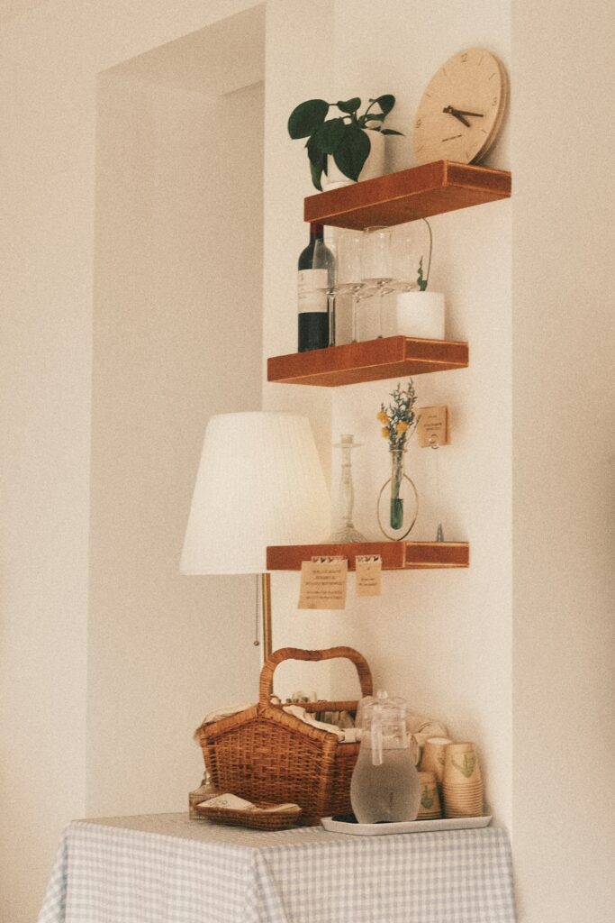
1. Floating shelves
Floating shelves are one of the easiest ways to add storage without taking up floor space.
They allow you to:
- store everyday items
- display decor
- keep surfaces clear
Because they’re mounted to the wall, they feel lighter than bulky furniture and don’t interrupt the flow of the room.Because they’re mounted to the wall, they feel lighter than bulky furniture and don’t interrupt the flow of the room.
Best for:
- Living rooms
- Bedrooms
- Kitchens
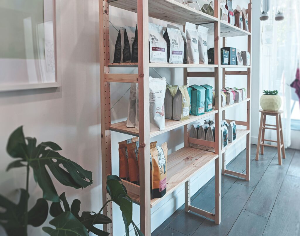
2. Tall cabinets or shelving units
Instead of using multiple low storage pieces, opt for one taller unit.
This:
- uses vertical space more efficiently
- reduces clutter at floor level
- draws the eye upward
Look for:
- slim designs
- open or partially open shelving
- lighter finishes
3. Wall hooks and mounted storage
Wall hooks are a simple but powerful solution, especially in smaller homes.
They help:
- free up floor space
- keep everyday items organised
- reduce visual clutter
Use for:
- bags
- coats
- towels
- accessories
Key Takeaway
When you use your walls, you free your floor.
And when your floor feels open, your whole space feels bigger.
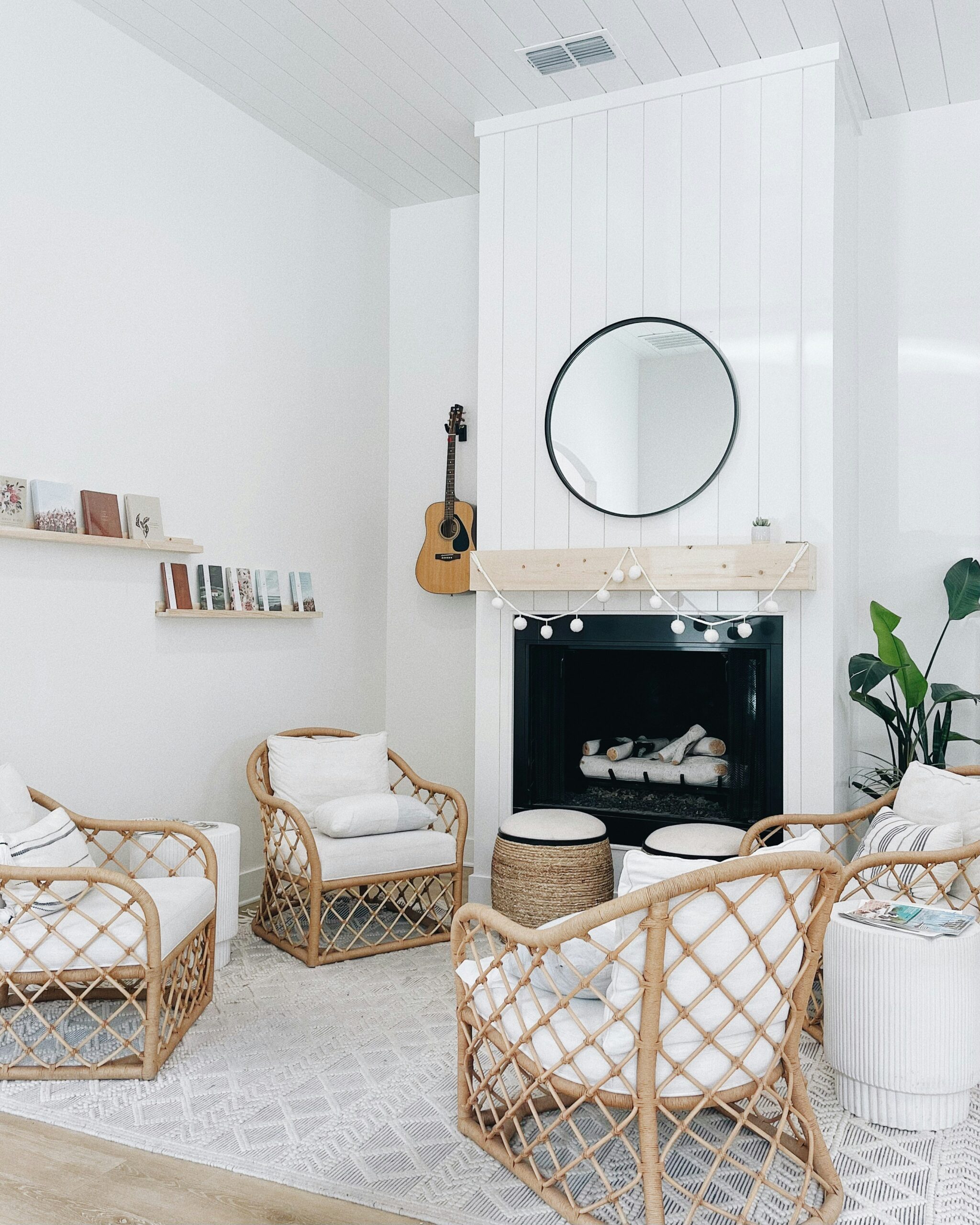
4. Use Mirrors Strategically (NOT RANDOMLY)
Why mirrors work
Mirrors don’t just reflect your space — they change how it feels.
When placed well, they:
- reflect light
- extend sightlines
- make a room feel brighter and more open
Key idea: Placement matters more than size
How to use mirrors properly
Opposite a window → Maximises light + openness
Mirrors bounce natural light back into the room, instantly making the space feel brighter and more airy. This is one of the easiest ways to make a small room feel bigger without adding anything new.
Near a light source → Brightens darker corners
Placing a mirror near a lamp or pendant light helps spread light more evenly, reducing harsh shadows and making the entire room feel softer and more inviting.
Reflecting open space → Makes room feel larger
When a mirror reflects clear floor space or an open layout, it creates the illusion of depth — almost like the room continues beyond the wall.
Reflecting clutter → Makes space feel messier
Mirrors double whatever they face. If they reflect busy shelves or cluttered surfaces, the room can feel more chaotic instead of calm — so placement matters more than size.
designer insight
Mirrors should reflect something beautiful — not clutter.
What your mirror reflects is just as important as where you place it. Always position it to enhance the space, not highlight what you want to hide. Use mirrors to amplify light and openness — not just to fill empty walls.
5. Fix Your Lighting Before You Fix Anything Else
If your space feels noticeably smaller at night than it does during the day, this isn’t a layout issue — it’s a lighting problem.
Most small rooms rely on a single ceiling light, which creates a very specific effect:
a bright centre with darker edges.
And here’s what most people don’t realise —
your brain uses light to understand space.
When corners, walls, or edges fall into shadow, your brain reads those areas as the end of the room. So even if your room hasn’t physically changed, it suddenly feels tighter, more enclosed, and slightly uncomfortable to sit in.
That’s why a space can look “fine” during the day, but feel cramped and flat at night.
What actually makes a room feel bigger
It’s not brightness.
It’s consistency of light across the entire room.
A well-lit small space doesn’t have one strong light source —
it has multiple softer ones that remove contrast and allow your eye to move freely without hitting dark patches.
Think of it like this:
you’re not trying to light the centre of the room.
You’re trying to gently illuminate the edges of it.
How to fix it (without overcomplicating your space)
You don’t need a full redesign — just a smarter distribution of light.
Start with this simple structure:
- Corner light (non-negotiable):
Place a floor lamp or tall light in the darkest corner of your room. This alone can visually “push” the wall outward. - Mid-level light:
Add a table lamp on a side table, console, or desk to soften the middle of the room and reduce contrast. - Optional wall or ambient light:
If your space still feels flat, a subtle wall light or LED strip (behind a headboard, shelf, or TV unit) adds depth without clutter.
The small details that make a big difference
These are the things most people overlook — but they’re what take your space from average to intentional:
- Bulb temperature matters more than you think
Stick to warm white (around 2700K–3000K). Cool lighting can feel harsh and clinical, which makes a small space feel even more rigid.
- Avoid spotlight-style lighting
Lights that create sharp beams or harsh shadows will break up your space visually.
- Don’t place all lighting at the same height
If everything sits at ceiling level, your room will still feel flat. You want light at different levels to create depth.
Common mistake to avoid
One of the biggest mistakes is thinking:
“I’ll just get a brighter bulb.”
Brighter light doesn’t fix poor placement.
It often makes the contrast worse — brighter centre, darker edges.
If your room still feels small after upgrading the bulb, the issue is not intensity — it’s distribution.
A simple way to test your space tonight
Turn off your main ceiling light and switch on only lamps.
If your room suddenly feels:
- softer
- more open
- more comfortable
Then you’ve just confirmed that your overhead lighting is what’s compressing your space.
Where this naturally fits into your setup
If you’re building out your space, this is where you start looking for:
- a slim floor lamp for corners
- a compact table lamp that doesn’t take up surface space
- soft ambient lighting that adds depth without clutter
You don’t need to overdo it —
even adding one well-placed light source can completely shift how your room feels.
Final takeaway
Before you move furniture, buy storage, or rethink your layout — fix your lighting.
Because once your space is evenly lit,
you’re no longer working with a “small room”.
You’re working with a room that finally feels like it has space to breathe.
6. Stop Adding Furniture — Start Replacing It
If your space feels crowded, your instinct is probably to look for more storage.
Another drawer.
Another basket.
Another “small space solution.”
But this is where most small homes go wrong.
The issue isn’t that you don’t have enough storage —
it’s that your space is made up of too many separate pieces trying to do separate jobs.
Why your room starts to feel busy (even when it’s “organised”)
Take a typical setup:
- a coffee table
- a storage basket next to it
- a side table
- maybe a small cabinet nearby
Individually, each item makes sense.
But together, they create visual fragmentation.
Your eye has to process each piece separately:
different shapes, heights, materials, functions.
And that’s what makes a room feel full — not just how much is in it, but how many individual elements your brain has to register.
The shift that changes everything
Instead of asking:
“What else can I add to make this work?”
Start asking:
“What can I replace so fewer things are needed overall?”
This is where small spaces start to feel intentional instead of crowded.
What this looks like in real life
Here are the exact swaps that make the biggest difference:
- Coffee table + storage basket → storage coffee table
One piece, same function, less visual interruption. - Bed + chest of drawers → bed with built-in storage
You free up an entire section of the room. - Desk + side table → compact desk with shelving or drawers
Keeps everything contained in one zone. - Multiple small tables → one larger, functional surface
Fewer legs, fewer breaks in the space.
What to look for when choosing pieces
Not all “multi-functional” furniture is actually helpful.
Prioritise pieces that:
- hide clutter, not display it
- have a simple silhouette (avoid bulky or overly detailed designs)
- don’t visually dominate the room
In small spaces, the best pieces are the ones that quietly do more — without drawing attention to themselves.
A quick test you can do right now
Look at any area in your room and ask:
“How many items are here to support one function?”
If the answer is more than 2–3, there’s usually an opportunity to simplify.
Common mistake to avoid
A lot of people swing too far and try to go “minimal” by removing things completely.
But then the space becomes impractical… and everything ends up back out again.
The goal isn’t less —
it’s less separation between functions.
Where this fits into your space long-term
This is the point where you start investing in pieces that actually improve how your space works:
- a storage ottoman that replaces extra seating + storage
- a bed that removes the need for additional units
- a compact desk that keeps everything contained
These aren’t just “nice to have” —
they directly affect how open and usable your space feels every day.
Final takeaway
Small spaces don’t need more solutions.
They need fewer, better ones.
When each piece in your room works harder,
you don’t just create more space physically —
you create a space that feels calmer, simpler, and intentionally designed.
7. Your Layout Is Either Creating Space — Or Blocking It
A room can have the “right” furniture, the “right” colours, and still feel cramped.
Why?
Because space isn’t just about what’s in a room —
it’s about how easily you can move through it.
And most small spaces don’t fail visually.
They fail functionally.
Why your room feels tighter than it actually is
Your brain is constantly scanning for ease of movement.
The moment you have to:
- step around furniture
- squeeze through gaps
- change direction mid-walk
your brain registers the space as restricted — even if there’s technically enough room.
This creates a subtle tension:
the room feels “off”, slightly uncomfortable, and smaller than it really is.
The shift that changes everything
Instead of arranging furniture based on walls…
Start arranging it based on how you naturally move.
Think about your real-life patterns:
- door → bed
- sofa → TV
- desk → storage
These are your primary pathways — and they should feel effortless.
How to fix your layout (practically)
1. Identify your main walking path
Stand at your doorway and trace the most natural route through your room.
That path should be:
- clear
- direct
- uninterrupted
If anything blocks it — that’s your first thing to adjust.
2. Stop forcing tight gaps
Tiny spaces between furniture (like squeezing between a bed and wall) don’t “save space” — they make it worse.
If you can’t walk through comfortably:
remove or reposition the piece
A smaller number of well-placed items will always feel more spacious than a crowded “complete” setup.
3. Don’t automatically push everything against the wall
This is a big misconception.
Yes, it sounds logical —
but when everything is pushed outwards, the centre of the room can feel awkward and disconnected.
In some cases, slightly pulling a piece forward (like a sofa or bed) can:
- improve flow
- create intentional zones
- make the layout feel more balanced
A quick test you can do right now
Walk through your room slowly.
Notice:
- where you hesitate
- where you adjust your body
- where movement feels tight
Those are your pressure points —
and fixing even one of them can change how your entire space feels.
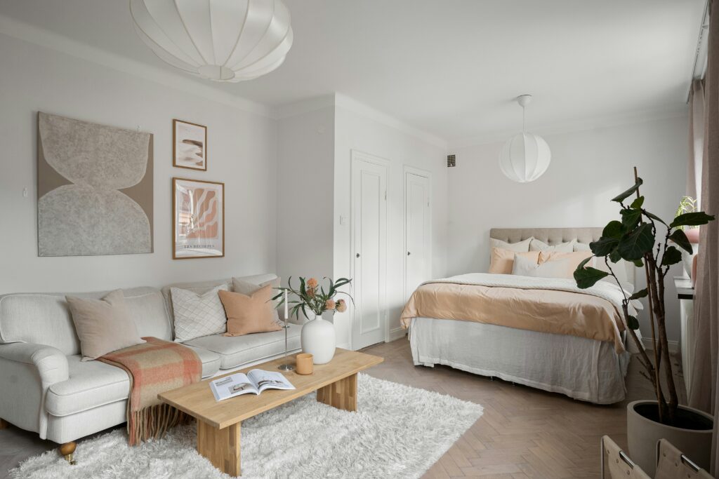
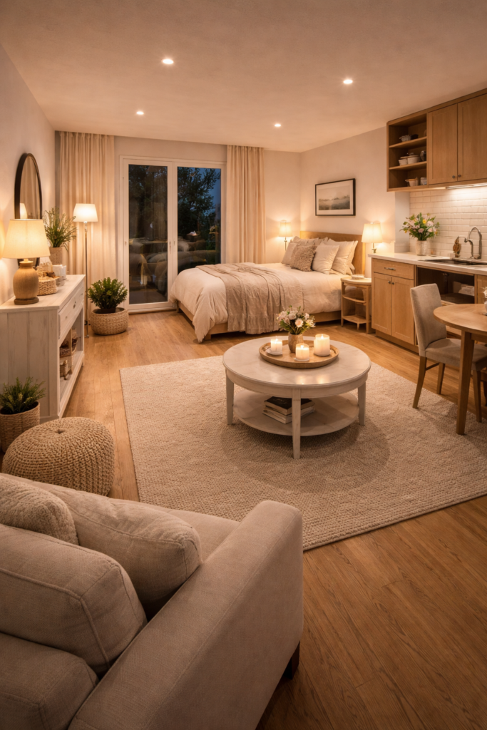
Clear, uninterrupted walking paths instantly make a small space feel more open and easy to move through
Common mistake to avoid
Trying to “fit everything in” at the cost of movement.
A room that holds everything but is hard to move through will always feel smaller than a room with fewer pieces and better flow.
Where this connects to your overall space
This is the stage where your room starts feeling intentional.
Once your layout flows properly:
- your lighting works better
- your furniture feels lighter
- your space feels easier to exist in
And that’s what people actually want —
not just a pretty room, but a room that feels effortless to live in.
Final takeaway
A small space doesn’t need perfect furniture.
It needs clear, comfortable movement.
Because when your layout works with you — instead of against you —
your space stops feeling cramped…
and starts feeling like it finally makes sense
8. Your Space Feels Smaller When Your Eye Has Too Many Places to Go
A small space doesn’t just feel cramped because of what’s in it.
It feels cramped when your eye doesn’t know where to settle.
Why this happens (and why most people miss it)
When you walk into a room, your brain doesn’t process everything at once.
It looks for structure:
- where to focus
- where to rest
- how elements relate to each other
But when a space has:
- too many small decor pieces
- too many competing textures or finishes
- too many “mini focal points”
your eye keeps jumping.
And that constant movement creates a subtle sense of chaos — even if the room is technically tidy.
This is what makes a space feel visually “busy”… and smaller than it actually is.
The shift that changes how your space feels instantly
Instead of trying to reduce how much you own…
Start controlling how many things compete for attention at once.
Because spacious rooms aren’t just minimal —
they’re visually calm.
What this looks like in real life
Look at any surface in your home:
- coffee table
- bedside table
- shelves
- console
Now ask:
👉 “How many separate things are fighting for attention here?”
If everything feels equally noticeable, that’s the issue.
When everything competes for attention, the room feels busier — and smaller — than it actually is.
Here’s how to fix it (without making your space feel empty)
- Group, don’t scatter
Instead of placing 5–6 small items separately, cluster 2–3 together so they read as one visual unit. - Create one clear focal point per area
For example: a lamp, a vase, or a stack of books — not all competing equally. - Let some areas stay visually quiet
Not every surface needs styling. Empty space gives your eye somewhere to pause. - Limit contrast within small zones
Too many colours or materials in one spot can break visual cohesion.
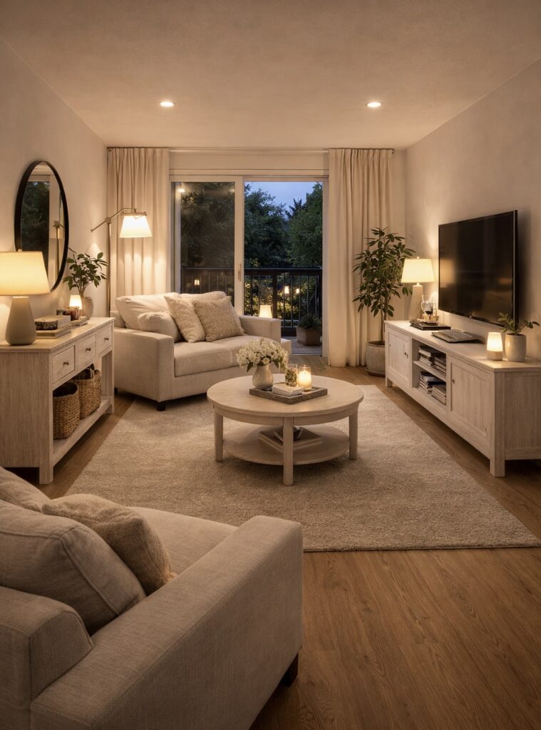
A visually calm space with fewer focal points allows the eye to move effortlessly, making the room feel more open and balanced.
A quick visual test you can do
Take a photo of your space.
If your eye doesn’t immediately know where to look first —
your room likely has too many competing elements.
Well-designed spaces guide your eye naturally.
They don’t overwhelm it.
Common mistake to avoid
Trying to make every corner “interesting.”
When everything is styled, nothing stands out —
and the room loses clarity.
Where this connects to your overall space
Once your visual field is calmer:
- your layout feels more intentional
- your furniture feels lighter
- your space feels more breathable
And this is what creates that subtle, high-end feeling people can’t always explain — but immediately notice.
Final takeaway
A small space doesn’t need fewer things.
It needs fewer things competing at the same time.
Because when your eye can move smoothly — and pause naturally —
your space stops feeling crowded…
and starts feeling considered, calm, and effortlessly put together.
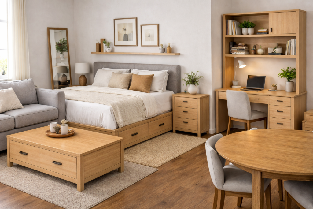
9. It’s Not About “Small Furniture” — It’s About Proportion
One of the biggest misconceptions in small spaces is this:
“I should just buy smaller furniture.”
And while that sounds logical, it often leads to a room that feels:
- disconnected
- awkward
- even smaller than before
Because the issue isn’t size alone —
it’s how everything relates to everything else.
Why “smaller” can actually make your space feel worse
When furniture is too small or too scattered:
- pieces feel isolated
- the room lacks structure
- your layout starts to feel fragmented
For example:
- a tiny rug under a full sofa
- multiple small tables instead of one defined surface
- undersized decor that doesn’t anchor anything
👉 Instead of opening up the room, this creates visual breaks — and those breaks make the space feel smaller.
The shift that actually works
Instead of focusing on “small”, focus on balanced proportion.
Every piece in your room should:
- relate in size to the pieces around it
- feel like it belongs within the same scale
- contribute to one cohesive layout
Because a well-proportioned room reads as one complete space, not scattered parts.
What this looks like in real life
Rugs that anchor, not float
Your rug should be large enough to connect key furniture.
- Living room: front legs of your sofa and chairs should sit on the rug
- Bedroom: the rug should extend beyond the bed, not sit underneath it like a small patch
A rug that’s too small breaks the room visually.
One strong surface instead of multiple small ones
Instead of:
- two tiny side tables
- a small coffee table
- extra scattered surfaces
Use:
one properly sized, functional piece
This reduces:
- visual breaks
- unnecessary legs and lines
- cluttered layout energy
Furniture that matches visual weight
If one piece is heavy (like a sofa), balance it with pieces that:
- aren’t too delicate
- aren’t overly bulky
You want consistency, not extremes.
A quick check you can do
Step back and look at your room as a whole.
Ask:
“Does anything feel too small, too big, or slightly out of place?”
That “off” feeling is usually a proportion issue — not a space issue.
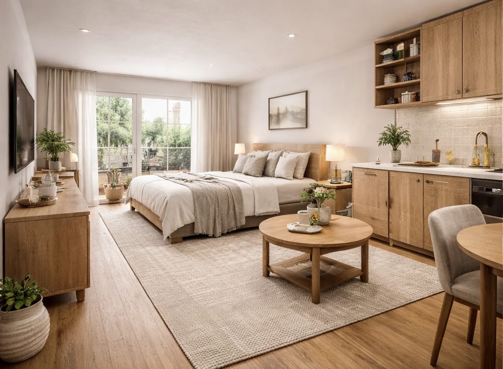
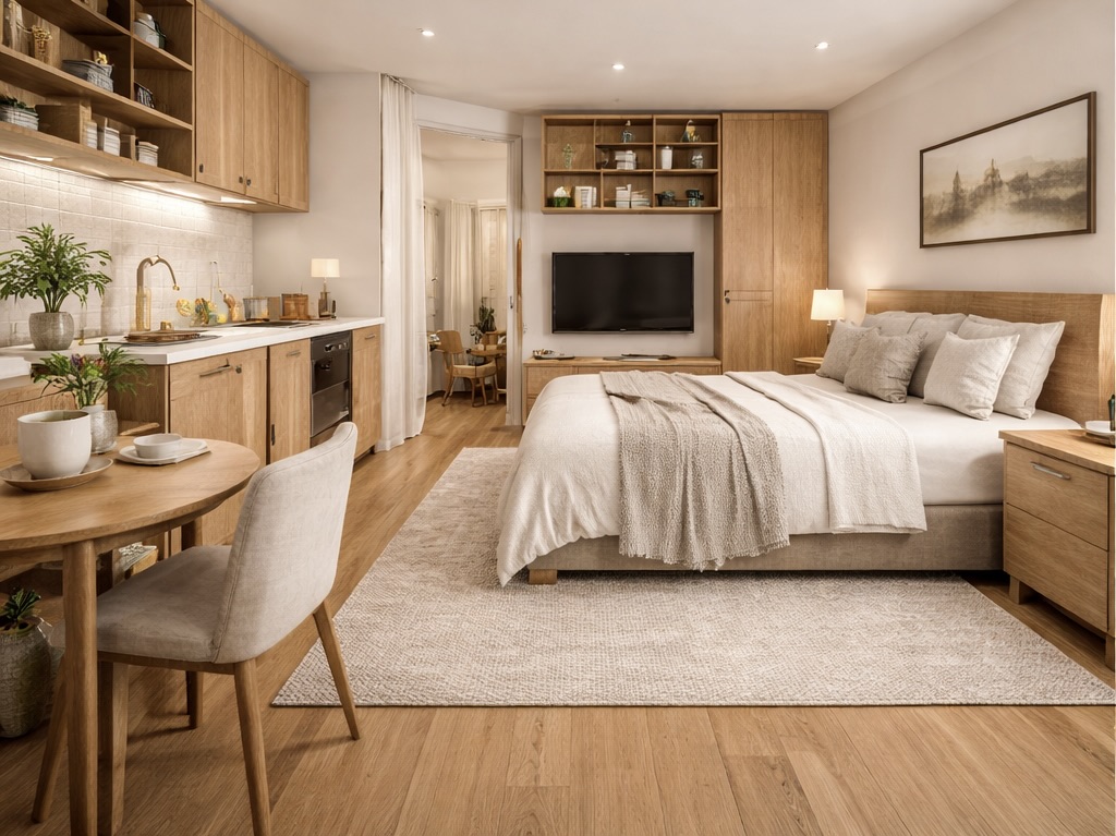
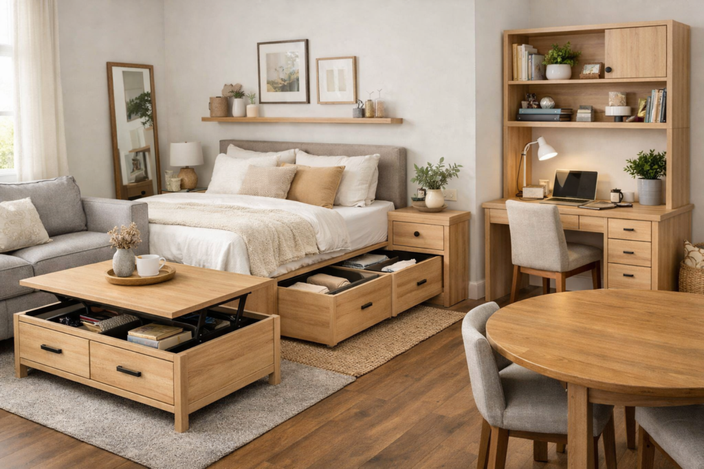
A well-proportioned studio layout where each piece is intentionally sized and placed, creating a cohesive space that feels open, balanced, and effortlessly functional.
Common mistake to avoid
Trying to “fit more” by choosing smaller and smaller pieces.
This often leads to:
- more items
- more gaps
- more visual fragmentation
And ultimately… a room that feels less intentional.
Where this connects to your overall space
Once your proportions are right:
- your layout feels grounded
- your furniture feels intentional
- your space feels complete
And this is what creates that subtle difference between:
– a room that looks decorated
– and a room that feels designed
Final takeaway
A small space doesn’t need smaller pieces.
It needs the right-sized pieces working together.
Because when proportion is right,
your room stops feeling pieced together…
and starts feeling like a space that was designed to work — not just fit.
10. Why Some Spaces Feel “Finished” — And Others Don’t
You can have the right furniture.
The right colours.
The right layout.
And your space can still feel… slightly off.
Not bad. Not messy.
Just unfinished.
Why this happens (and why it’s hard to explain)
A finished space isn’t about how much you’ve added.
It’s about whether everything feels resolved.
When a room feels unfinished, it’s usually because:
- something feels visually incomplete
- elements don’t fully connect
- your eye doesn’t feel “settled”
And even if you can’t point to the exact problem,
you can feel it.
The shift that changes everything
Instead of asking:
“What else should I add?”
Start asking:
“What’s missing that would make this feel complete?”
Because most of the time, it’s not about more —
it’s about the right finishing layer.
What a “finished” space actually includes
These are the subtle details that most people skip —
but they’re what make a space feel intentional.
1. Grounding elements
Every space needs something that visually anchors it.
This could be:
- a properly sized rug
- a coffee table that connects seating
- a bed styled with enough visual weight
Without this, furniture feels like it’s floating.
2. Height variation
If everything sits at the same level, the room feels flat.
A finished space has:
- low elements (sofa, bed)
- mid elements (tables, seating)
- taller elements (lamps, plants, curtains)
This creates depth and movement.
3. Intentional styling (not over-styling)
It’s not about decorating every surface.
It’s about:
- placing a few pieces with purpose
- creating small moments of interest
- avoiding random, disconnected decor
4. Visual balance
A space feels unfinished when one side feels heavier than the other.
For example:
- all furniture on one side
- one area over-decorated, another empty
Balance doesn’t mean symmetry —
it means the room feels stable.
A quick test you can do
Stand in your space and ask:
“Does anything feel like it’s missing — or slightly off?”
If your answer is yes, it’s usually one of these:
- something needs grounding
- something needs height
- something needs simplifying
Common mistake to avoid
Trying to fix an unfinished space by adding more decor.
This usually leads to:
- clutter
- confusion
- even less clarity
Instead, focus on:
refining what’s already there
Final takeaway
A finished space isn’t about having more.
It’s about everything working together.
Because when your space feels complete,
you stop noticing individual pieces…
and start experiencing the room as a whole.
Your Space Was Never the Problem
The Strategy Was
A small space doesn’t mean limited potential — it just means every choice matters more.
When you start using light intentionally, choosing the right scale, and letting your space breathe, everything shifts.
What once felt cramped can feel calm.
What once felt unfinished can feel styled, intentional, and complete.
This is the difference between a space you live in… and a space that actually supports your lifestyle.
Now It’s Time to Bring It Together
Start with just one change. A better layout. Softer lighting. A piece that actually fits your space.
You don’t need more — you need better choices.
If you’re ready to elevate your space, these are the pieces that make the biggest visual difference without overwhelming your room:
Shop the Look
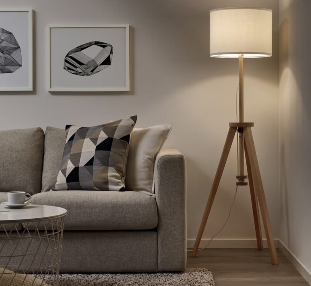
Floor lamp
IKEA
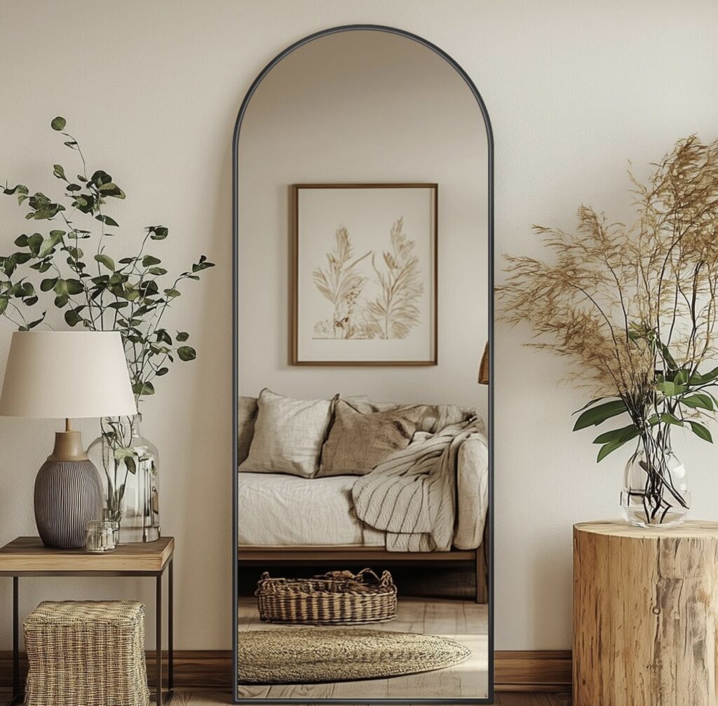
Full Length Mirror
Amazon
Full Length Mirror
H&M Homed
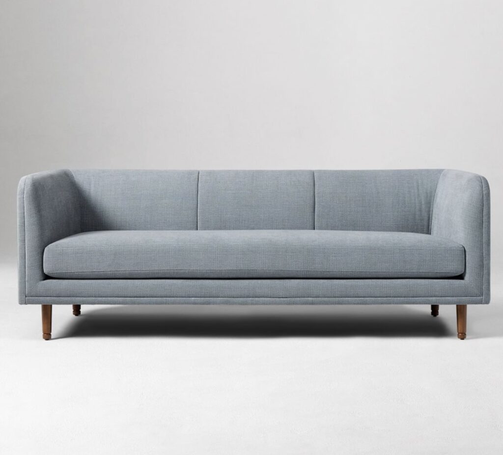
Marcel Sofa
Marcel Sofa